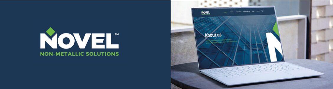
A NOVEL JOURNEY
UNIFYING VISION
THE JOINT VENTURE OF SAUDI ARAMCO AND BAKER HUGHES
Novel Non-Metallic Solutions was born of a joint venture between two formidable companies.
The first: Saudi Aramco, the largest company in Saudi Arabia’s oil industry and the third largest company in the world (by market cap) which has served as the financial lifeblood of the Saudi kingdom for the past 20 years. The second: Baker Hughes, an American company, although predominantly in the oil industry, but which is at the cutting edge of technology in terms of alternative substrates and technologies in the pursuit of less harmful effects on the planet. They are not a ‘green’ company in and of itself, but they are a responsible company with a vision for the future.
This marked the inception of Novel, a non-metallic solution for piping within the world of oil, a very innovative future-focused thought, in line with the ideals and principles underpinning the 2030 vision of both Saudi Aramco and Baker Hughes, Novel will become an active player in a sustainable world.

We undertook this project that was complex on many levels to create a new identity for these two companies that came from very different parts of the world, that had very different histories and brand DNAs, to align them with a shared vision and overarching entity. Functionally, we had to create an identity that laid an inclusive and neutral platform to create a strengthened unity between the two diverse worlds uniting under one brand. The challenge was interesting, and the Berge Farrell team did a deep dive into the history of both companies to ensure we find the equilibrium in impeccable design insights based on the vision of the joint venture between Saudi Aramco and Baker Hughes.
We had an understanding of the following:
- It was a joint venture between an international company and an in-Kingdom company.
- Novel operated within an industrial environment. However, a very distinct leaning towards being more sustainable, towards alternative substrates, and embracing a future world.
- All of our interactions with the client were extremely positive, and the high-level team could see arguments and debate issues. There were very few agendas. It was just a sort of a mutual drive towards an exciting and logical end.
So, we set off to brainstorm the perfect concept for Novel, we extensively researched colours that embodied strength and communicated a clear sense of purpose, aligning closely with the brand’s vision and mission. Evidently, the resulting colour scheme comprised shades of purple, white, and green. Considering the company’s dynamic and ambitious nature, we understood the need to employ strategic design elements to set it apart. Therefore, it became evident early on that a bold font was essential for our stylistic approach.
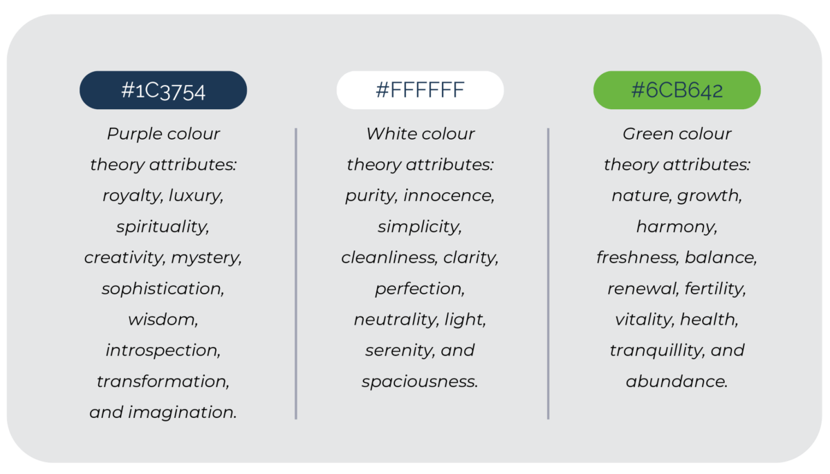
As we delved further into the design process, the decision emerged to utilize a font that harmonised with the chosen colour palette: white against a purple backdrop, complemented by accents of green. We found these influences more intriguing than relying heavily on green, which tends to be associated with future and sustainability themes. Such predictability could diminish the brand’s impact. We aimed to portray a powerful and rapidly advancing brand, hence the decision to utilize white against purple, with subtle touches of green.
We encountered challenges along the way because simplifying and boldening the font risked overshadowing the Arabic influence, characterized by its intricate cursive script with dots and accents, and its right-to-left reading direction. In our endeavour to blend these influences, we closely examined the Arabic letter “N,” noticing its lowercase form with a dot positioned to the left above the letter. This observation intrigued us as it provided a subtle and meaningful nod to our Middle Eastern partners, affirming their integral role in the company.
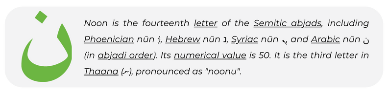
The brand name “Novel” was coined by the joint venture between Saudi Aramco and Baker Hughes, prompting Berge Farrell to recognize that the essence of its identity was rooted in the very first letter of the word, “N. The initial letter, while modern and progressive for 2024, retained an Arabic essence, which sparked immediate enthusiasm. Notably, the letter “N” appeared almost cube-like in its design. The augmentation of the green accent and shape above the “N,” showing reverence to Arabic aesthetics, brings the cube motif to fulfilment. This symbolism extends to the complex functionality of piping systems, illustrating their capacity to transport materials and facilitate various angles with precision.
This enables the residual typography to affirm its presence adequately, embodying a company firmly rooted and impervious to disruption. Once we achieved the desired typography, the entirety of the brand ecosystem seamlessly fell into place, with the interplay between the full word “Novel” and the stylized “N” with the green accent, strategically implemented where deemed appropriate. Thus, serving as a portable emblem, the N accounted for approximately 70% of its application, embodying the Arabic midpoint.
This project proved immensely successful, bringing together an American and Arabic company under one unified entity. Both parties were not only excited but also felt profoundly at ease operating within this collaborative framework. The brand mark, while subtle in its simplicity, carried profound significance, fostering a sense of pride in both parties who could discuss its symbolism with great gratification.